

Color
Color Builds
CU Black

HEX #000000
CMYK 0, 0, 0, 100
CMYK 40, 40, 40, 100 (Rich Black)
RGB 0, 0, 0
PMS Black
CU Gold

HEX #cfb87c
CMYK 0, 10, 48, 22
RGB 207, 184, 124
PMS 4525C
Thread Color Vegas Gold
Dark Gray

HEX #565a5c
CMYK 38, 28, 21, 63
RGB 86, 90, 92
PMS 425C
Light Gray

HEX #a2a4a3
CMYK 16, 11, 11, 29
RGB 162, 164, 163
PMS 422C
White

HEX #ffffff
CMYK 0, 0, 0, 0
RGB 255, 255, 255
PMS White
Usage
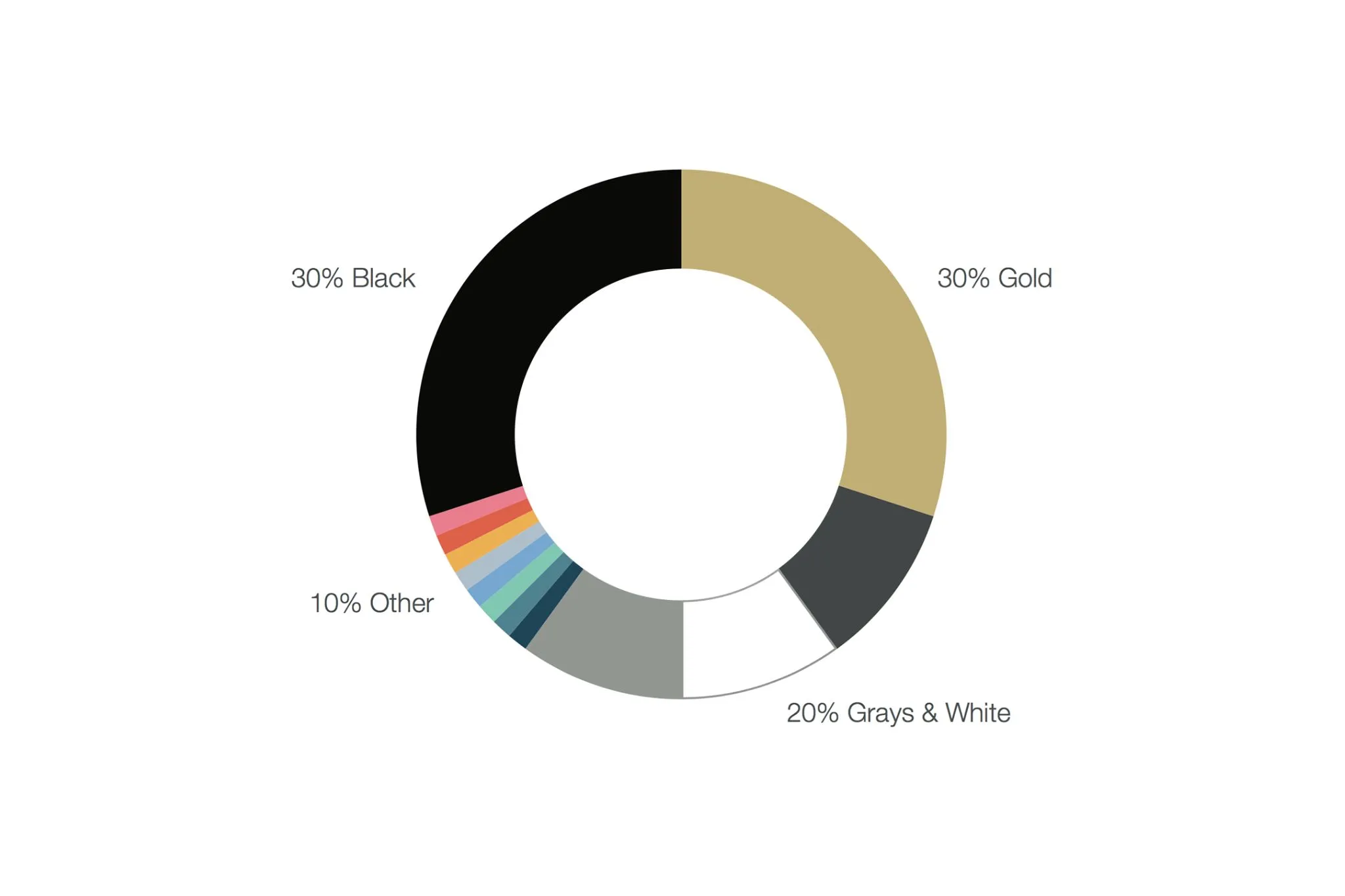
Color can strategically organize information, elevate the impact of a piece, and provide visual cohesion between various products. Color is used slightly differently when creating handheld pieces, environmental objects like a poster, and digital designs, such as websites or presentations. Below is some general guidance on how to use our colors.
Gold works best when used sparingly. It is our highlight color, and can draw the audience's attention to the most important two or three elements. It can pop as gold text on a black background, or be used sparingly as a background color with black text. On a handheld piece such as a brochure or postcard with more body text, white backgrounds are generally preferred, and colors such as CU Gold are effective when used to highlight a headline, call out important information, or differentiate a graphic. Gold and white typically do not create enough contrast.
Black creates strong contrast to both gold and white. Too much black can make a piece feel heavy and dense. Black backgrounds tend to be appropriate in applications such as environmental graphics to create impact, especially if you have large gold or white text. Because environmental graphics such as banners or posters may be viewed from a distance, floods of color enhance the contrast to make the piece more legible, where similar treatments in handheld or digital applications may feel too heavy.
White and grays should be used to organize information and provide hierarchy, as well as provide white space for effective emphasis, breathing room and readability.
Legibility should always be prioritized.
Tertiary and Other Colors should generally only be used as small pops of color within otherwise UCCS-branded materials, where black and gold are prominent, and other colors are used sparingly, to convey a specific meaning or information hierarchy. (See Accent and Tertiary Colors.)
Accessibility and Contrast
In general, gold text works best on black backgrounds, and is less legible or accessible on white backgrounds if too small. When using gold text on a white background, prefer large font size and bold weights. White text on gold background generally also lack enough contrast for legibility and accessibility, unless large and bold. The chart below is a guide to verify that your background color and text color meet accessibility standards, especially for digital usage, such as websites and presentations.
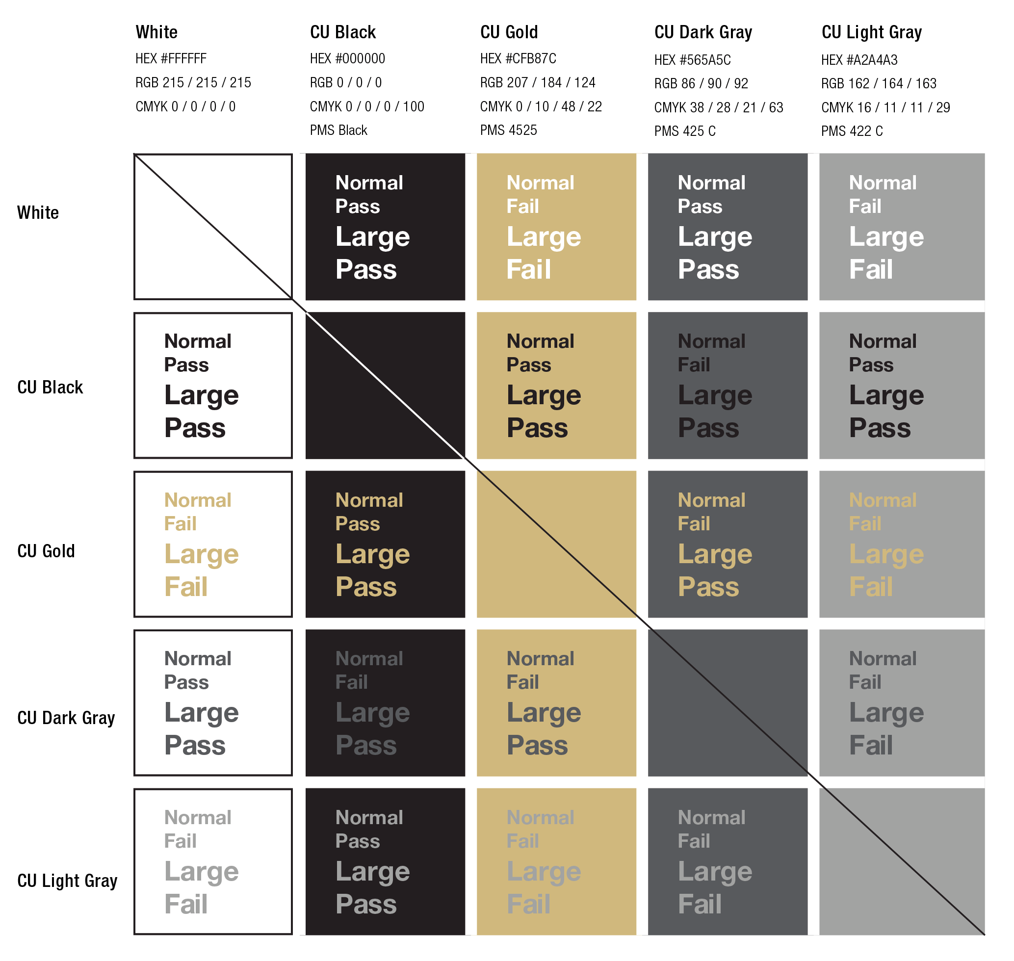
Normal text: 14 POINT BOLD (18.66PX) OR LARGER
Large text: 18 POINT (24PX) OR LARGER
Contrast for digital screens: WCAG 2.0 LEVEL AA REQUIRES A CONTRAST RATIO OF 4.5:1 (NORMAL TEXT) AND 3:1 (LARGE TEXT).
Spot Gold
Flagship printed materials should use spot gold PMS 4525C whenever possible. Use rich black when appropriate. Build based on printer specifications.
Accent and Tertiary Colors
Units are encouraged to be creative with CU’s official color palette (gold, black, dark gray, light gray). It should be the dominant in all applications, but units can work with the UCCS Brand and Design office to explore varying shades, gradient, texture and depth of the CU color palette. While tints and shades of the CU colors can be used sparingly, we encourage you to work with the UCCS brand manager to ensure uses support the UCCS brand, such as avoiding uses of pale beige or tints of CU Gold that appear too brown or too green.
Variation Examples
Typography Darker Gray: #3c3e40 (used for text color on headline and body copy on a white background.)
Off-Black: #222
Bright Gold: #dfc88c (used in digital applications on interactive elements such as a button background color, to provide more contrast for dark or black text. Should not replace CU Gold for general use.)
Brighter Gold: #efd89c (used such as for a hover color for Bright Gold interactive elements.)
Link Blue: #0854BB (used as the text color for clickable links)
Link Dark Blue: #063D8A (used as a hover text color for clickable links)
Tertiary Colors
The subtle use of tertiary colors in digital and print publications is acceptable within limits. Units should avoid the prominent use of colors that are closely associated with other universities (eg. Green – Colorado State University; red – University of Nebraska). This does not mean those colors cannot be used, only that they should not be the dominant color. Tertiary colors should appear only as small pops of color within otherwise UCCS-branded materials, where black and gold are prominent. Use tertiary colors in content, not to establish a visual sub-identity. Tertiary colors should be complimentary and used sparingly, specifically to direct attention or highlight important information. An example palette of complimentary tertiary colors is available upon request, or often tertiary colors can be pulled from and compliment photography used in the design.
Action Colors
In select cases, colors beyond our brand colors may be used to indicate important information and/or recommended user action. Action color use is rare and limited to shades and/or circumstances such as:
- Red = warning, danger, no, not permitted
- Yellow/Orange = caution, construction
- Green = safety, approval, go, yes
- Blue = hyperlink
Keep in mind that information should never be conveyed in color alone - especially in digital uses, colorblind and low vision users may not be able to perceive the color differences, and screen readers do not announce colors to non-sighted readers.
Other Uses
Print and digital marketing and communications material should always use the colors as defined in the brand standards.
Uses other than print and digital marketing material, such as interior and exterior paint, cut vinyl, etc, might vary from the CU Gold Pantone color depending on the application. Please contact the brand manager for guidance.
Sherwin Williams “Believable Buff” is an interior paint color reasonably similar to CU Gold, and various metallic gold paint colors or architectural finishes such as 3M Di-Noc Architectural Finish Metallic ME-486 might be appropriate for certain applications. Please work with the campus brand manager to determine the best fit.