UCCS Logo Usage
UCCS Logo Usage
UCCS logo standards are detailed in the UCCS Brand Identity Standards. These basic guidelines illustrate usage and placement of the UCCS logo and unit signature extensions. View trademark and vendor guidelines here.

You can download high resolution and vector files for the UCCS logo for university-related communication and marketing publications on the UCCS logo downloads page.
Clear Space

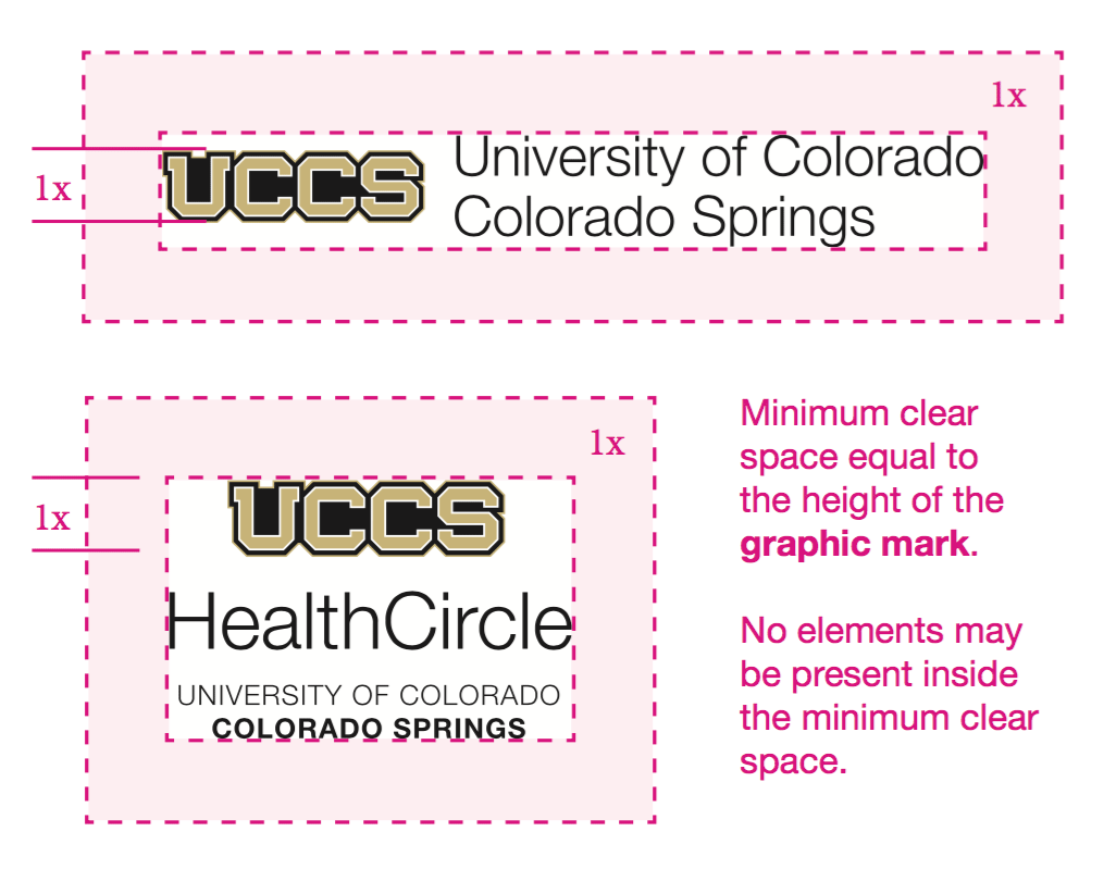
Placing the UCCS logo too close to other graphic elements or page edges diminishes its importance. When placing the logo, please maintain a minimum clear space around the logo equal to the height of the graphicmark.
The same rule applies to customized Signature Extensions.
Placement and Sizing
The UCCS logo marks material as "officially from UCCS." In general it's best to consider the logo to be like a signature, signing the document as official. When possible, separate the logo from other content.
Do not crowd the logo or treat it like a headline; prefer it smaller with more clearspace, to give the logo appropriate presence and esteem.

Example of meeting the minimum clear space. When possible, exceed the minimum.

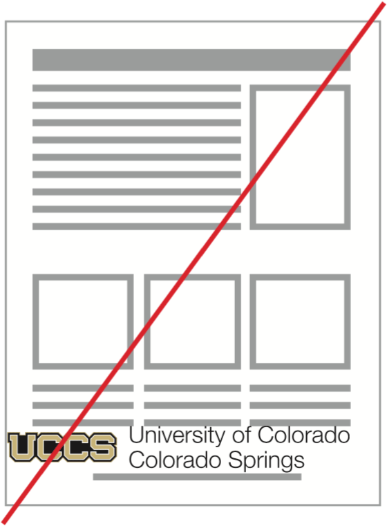
Does not meet the minimum clear space requirement. Logo is too close to other text, graphic elements and page edges.
You can download high resolution and vector files for the UCCS logo for university-related communication and marketing publications on the downloads page.