

Typography
Typography
Typography is an essential part of our personality. It helps unify our materials and promotes familiarity with our messaging.
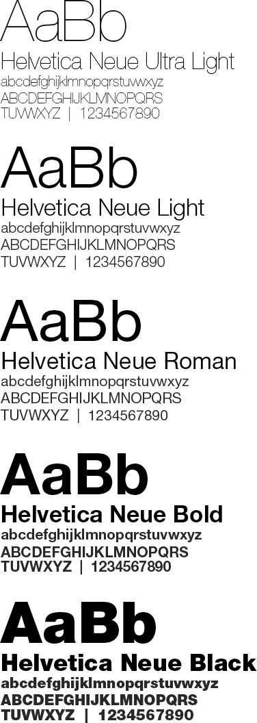
Our typeface is Helvetica Neue, (pronounced “noy-a” or “new”). It is a classic sans serif face: simple, modern, and elegant. The openness and geometry of its form make it highly legible. It works equally well for display type and body copy. Helvetica Neue is recommended for use as the fetured typeface in all University of Colorado communications.
Substitutes
When Helvetica Neue is not available, Helvetica is a suitable substitute. Inter, Roboto, Source Sans Pro, Acumin Pro, or Arial may be used when Helvetica Neue or Helvetica are not available, such as in shared documents or web and electronic communications, when you cannot rely on the typeface to be installed on audience computers.
Tips
- Use typefaces and font sizes consistently to indicate role – all titles of equal importance should looks the same, for example. Information of a type should look alike. Headers should look like other headers. Body text should look like other body text. Small variations in size are confusing. (See more about typographic hierarchy below.)
- Use Helvetica Neue as the default for all text, and only deviate with purpose, such as sparing use of a script or serif typeface when thematically appropriate. Too many fonts can make the design seem busy and even interfere with the user’s perception of the visual hierarchy. Don’t let a typeface distract from the design; in general, think about how can you make the typography powerful by playing with weight and dimensions instead of different typefaces.
- Turn off auto-hypenation
- Right-size your text column width, also referred to as measure, for optimal legibility: too narrow (fewer than 5 words per line) or too wide (more than 15 words per line) can negatively impact legibility. 9-15 words per line (or 50-75 characters per line) is recommended. Err on the side of longer measures when using justified text alignment
- Prefer left-aligned text in most cases; use centered, right-aligned, and justified alignments sparingly
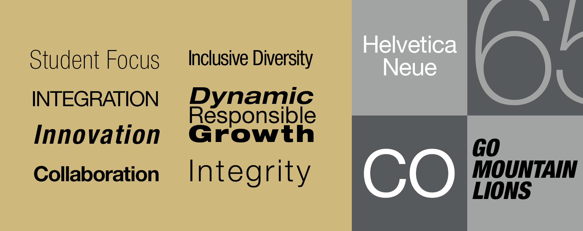
Typographic Hierarchy
Typographic hierarchy is critical to establishing visual hierarchy. Among a typeface's most important attributed are weight – the width of the strokes that compose its letters, and size – the height and width of the letters. Other modifications like italicization can play a role too.
Example Hierarchy:

Typeface Licensing
A limited number of licenses for Neue Helvetica are available, free of charge, to professional campus communicators who agree to use them within our brand parameters. To request a font package, please contact brand@uccs.edu.
Units and individual users may also purchase Neue Helvetica for their own use from fonts.com.
Inter or Roboto are both available for use, free of charge, from Google Fonts.
Licensing FAQ
A typeface license means you can use the typeface in your designs and publications. Licenses are per-machine so each computer you want to have the typeface installed on is considered a single license.
A license for the basic package, which includes 6 fonts from Thin to Bold, is $149 from Linotype, and the complete "Pro" family is $1,299. The university has purchased several licenses of the basic package to distribute to campus users free of charge. Contact brand@uccs.edu to inquire about a typeface license.
There are a limited number of free licenses available, so we ask that you request only as many as you need and will use.
You can either purchase the font license or request to receive one of the free licenses if any are still available. Please contact brand@uccs.edu.
You can use the contact form or send questions to Gabby Hensley in University Marketing and Communications at ghensley@uccs.edu.
Resources
- Neue Helvetica® – Purchase Neue Helvetica® at myfonts.com
- Neue Helvetica® – Purchase Neue Helvetica® at fonts.com
- The Inter Typeface Family – Designed by Rasmus Andersson, also available from Google Fonts.
- UCCS Brand Identity Standards – Official website for UCCS brand standards and graphic guidelines