

Design Foundations
Design Foundations
The UCCS brand is more than a logo: it's the combination of colors, typography, layouts, and messaging that creates a consistent and recognizable experience. Applying these design foundations across print, digital, and environmental materials strengthens the university's identity, builds trust with our audiences, and ensures every communication feels unmistakably UCCS.
Color
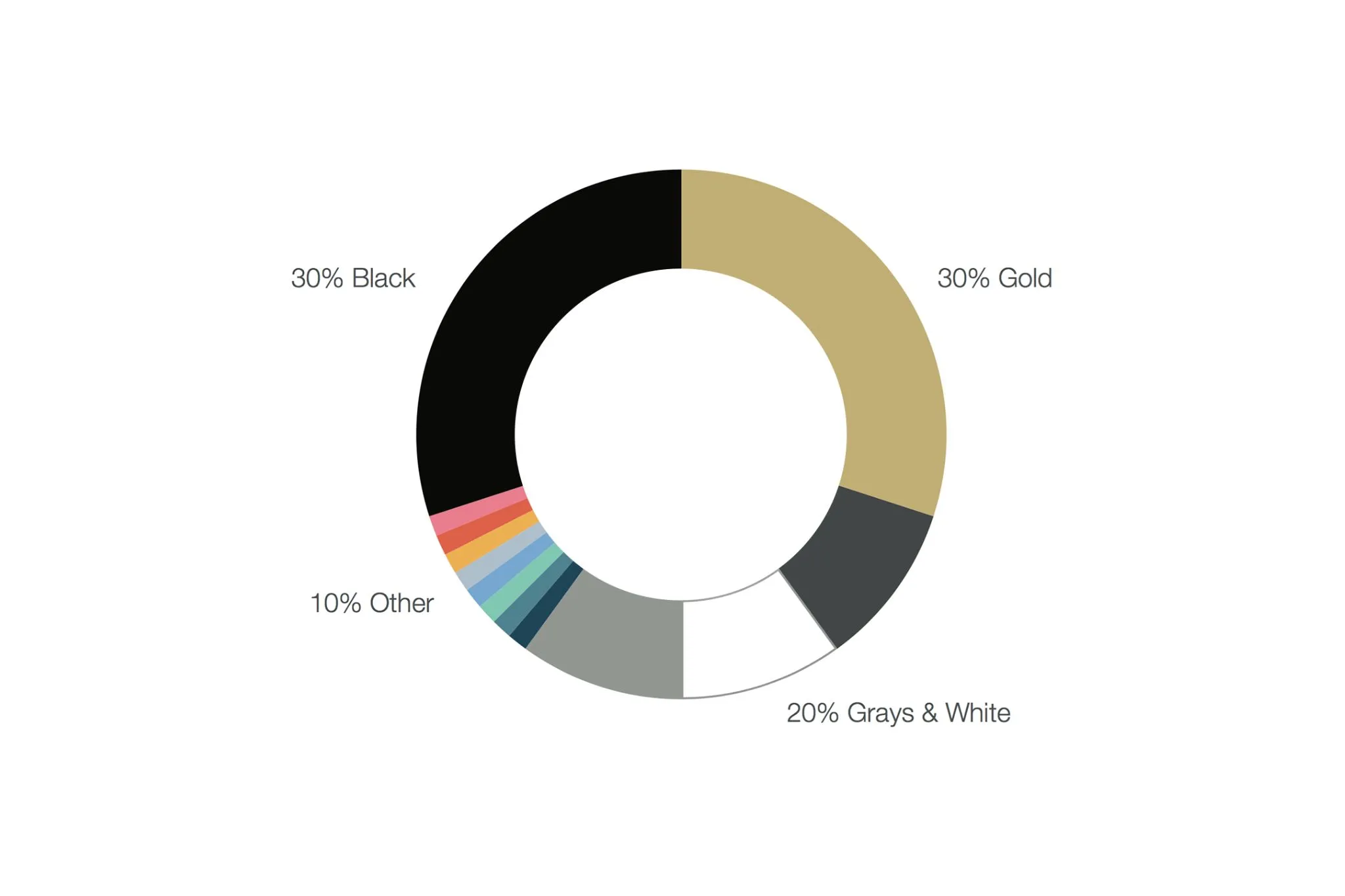
The UCCS color palette is rooted in the official University of Colorado colors, black and gold, with additional supporting colors that provide flexibility while maintaining a cohesive visual identity. Using the approved color palette consistently helps strengthen brand recognition, improve accessibility, and create a unified look across print and digital communications.
Typography

Typography plays an important role in creating a recognizable and professional brand. UCCS uses approved typefaces and text styles to ensure consistency, readability, and accessibility across all communications. Following these standards helps create materials that are both visually engaging and easy to read.
Layout & Design

Thoughtful layouts bring the UCCS brand to life by creating clear, organized, and visually compelling communications. Consistent use of spacing, alignment, imagery, graphic elements, and hierarchy helps guide the reader's attention while creating a polished and cohesive experience across print and digital materials.
Brand Voice

Every communication should sound like UCCS. Our brand voice is authentic, confident, welcoming, and student-centered, reflecting our commitment to opportunity, innovation, and community. Following these guidelines helps ensure a consistent experience, whether you're writing for the web, social media, email, or print.
Additional Resources

Find additional tools, templates, examples, and supporting guidance to help you confidently apply the UCCS brand across a variety of projects and communication channels.